
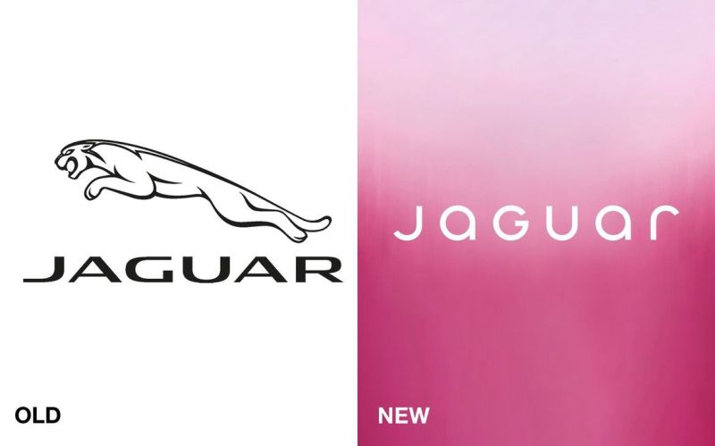
The Logo Wasn't the Problem
In November 2024, Jaguar released a rebrand teaser with no car in it. Elon Musk’s response, seen by millions, was two words: “Do you sell cars?”
Within days, the new logo had become one of the most mocked pieces of design online. Competitors posted parody rebrands just to pile on. A hundred-year-old British carmaker had, for a moment, become the internet’s punchline.
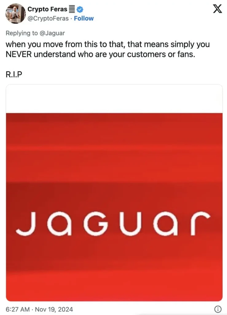
Here’s what makes it worth studying: the rebrand wasn’t careless. It was a deliberate, well-funded strategy behind a real business problem — Jaguar’s sales had been falling for years, and its next lineup would be fully electric, priced nearly double, aimed at a different buyer entirely. The design team knew what they were doing. The backlash happened anyway.
What Actually Went Wrong
The launch film led with models, slogans, and a pink-and-blue palette — and no vehicle.(You can watch it here: https://www.youtube.com/watch?v=rLtFIrqhfng). The leaping cat, Jaguar’s most recognisable symbol for a century, was reduced to a footnote.
For a brand whose entire value lived in heritage, that sequencing mattered. People weren’t reacting to a new logo. They were watching a hundred years of familiarity vanish before being shown anything to replace it with.
It’s a Pattern
Jaguar isn’t rare. Gap’s 2010 logo change was reversed within a week — not because it was badly designed, but because it was unfamiliar and unexplained. Tropicana’s 2009 packaging redesign dropped sales roughly 20% in weeks; loyal buyers, reaching for the product on autopilot, simply couldn’t find it.
In each case, the new design wasn’t really the problem. The disruption was.
Why We Resist
Psychologists call it loss aversion — we feel losing something familiar more sharply than we feel gaining something better. A logo isn’t just a graphic. It’s years of stored trust. Change it too fast, and people don’t feel “improvement.” They feel absence.
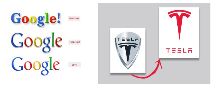
So — what if the change is smaller? Some brands avoid the backlash entirely by never giving anyone a single moment to react to. Google’s wordmark has shifted at least four times since 1998 — colours, serif to sans-serif, then to today’s flat “G” — and almost none of it registered as a “redesign” while it was happening. Tesla’s logo has quietly flattened and simplified too, without a single viral moment attached to it. The lesson: change slowly enough, and familiarity never actually breaks.
Social media just speeds up the verdict. A quiet “huh, that’s different” now becomes a tweet, then a headline — often before the brand finishes explaining itself.
The Takeaway for Designers
Heritage brands do need to evolve. But a redesign isn’t only a visual decision — it’s a psychological one, and the rollout is part of the design. The brands that get this right change gradually, keep one anchor of recognition, and explain the why before asking anyone to accept the what.
Final Thoughts
Backlash rarely means bad taste. It usually means people valued what came before — and weren’t given room to arrive at the new version on their own terms.
At Artiste 360, we teach students that identity design is a relationship with an audience, not a single reveal. The best creative work doesn’t just ask, does this look right? It asks, how will this land, and with whom?